Luxe Hocking Case Study
Uncovering the Story That Brought a Collection of Luxury Cabins Together
Project Overview
Luxe Hocking came to us after years of thoughtfully growing a collection of luxury cabins and lodges throughout Hocking Hills, Ohio.
The properties were already successful individually, with a return guest rate of more than 70%. As the portfolio grew, the owner saw an opportunity to bring the collection together under one recognizable brand and make it easier for guests to discover and move between sister properties.
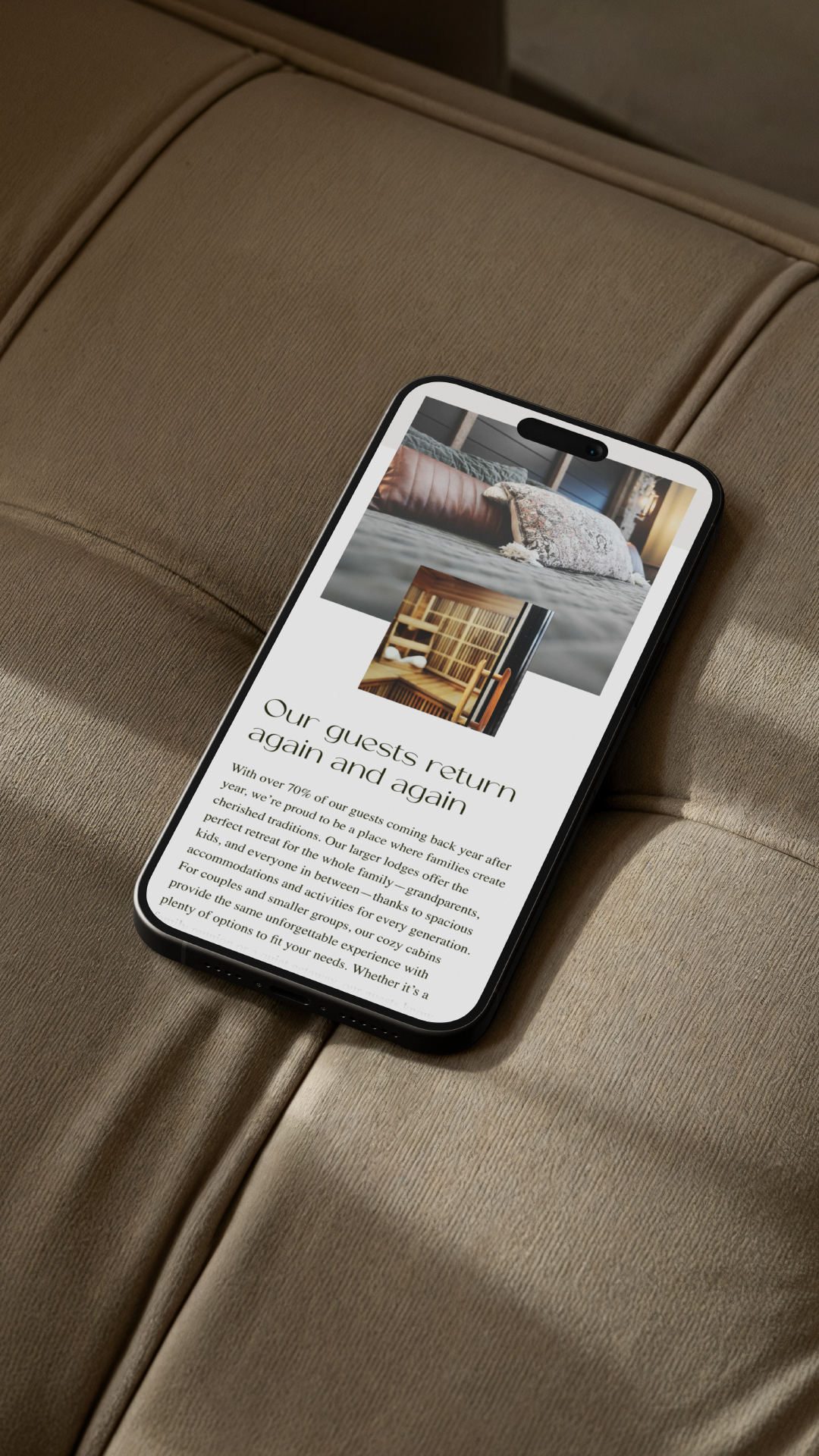
Each property had its own character and established guest experience, but the portfolio had yet to be connected at the brand level. A central website, visual identity, and brand story would give guests a clearer way to recognize the properties as part of the larger Luxe Hocking collection.
Luxe Hocking brought in Studio MADM Co to connect the portfolio through brand and story. The result needed to do more than bring 15 properties under one name. It needed to create recognition across the collection without flattening the individuality of each property, while giving Luxe Hocking a brand system capable of supporting the next stage of growth.
The first step was identifying what made the collection distinct enough to build around.
The Strategy
The Brand Concierge established the strategic foundation for the brand, but it wasn't until the on-site property visit that the story connecting the portfolio became clear.
The owner had personally shaped many elements of the guest experience, from the landscaping to the private hiking trails throughout the properties. During the visit, one detail kept appearing across the collection: the Canna Lily.
This flower had been intentionally planted throughout the properties for its resilience and ability to thrive through the seasons. What initially appeared to be a landscaping detail was actually something specific to Luxe Hocking — and an opportunity to give the brand an identity of its own.
Rather than relying on the familiar visual language of Hocking Hills cabin rentals (i.e, pine trees, pinecones, and other outdoor-inspired elements) we built the brand around something that already belonged to the properties.
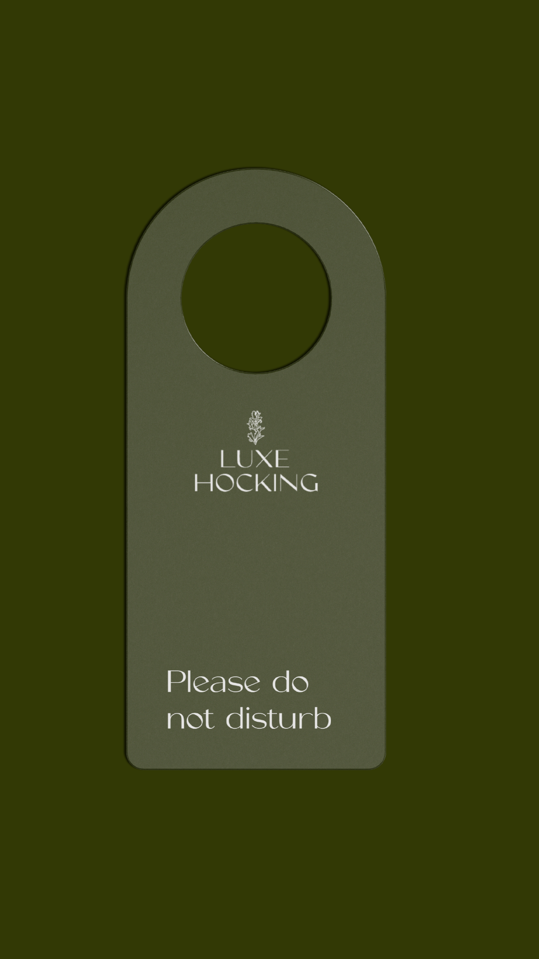
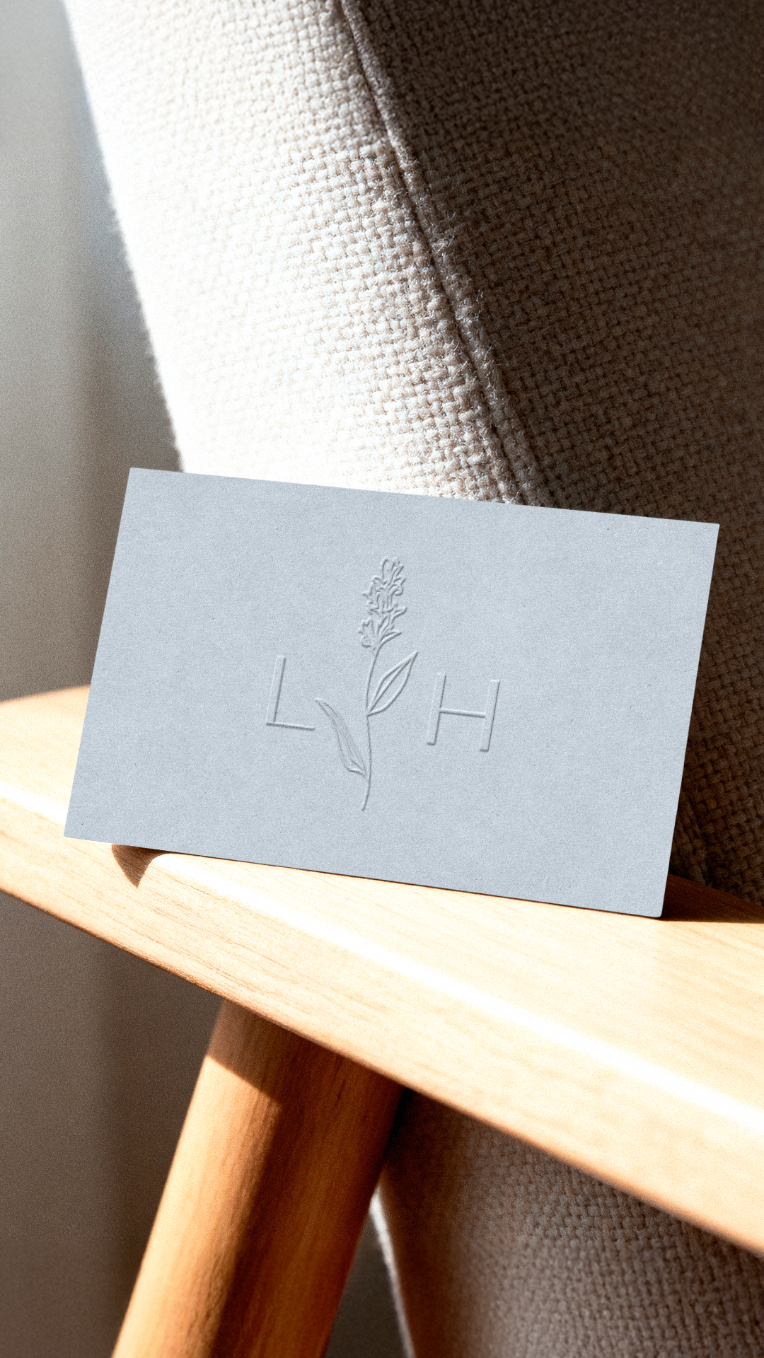
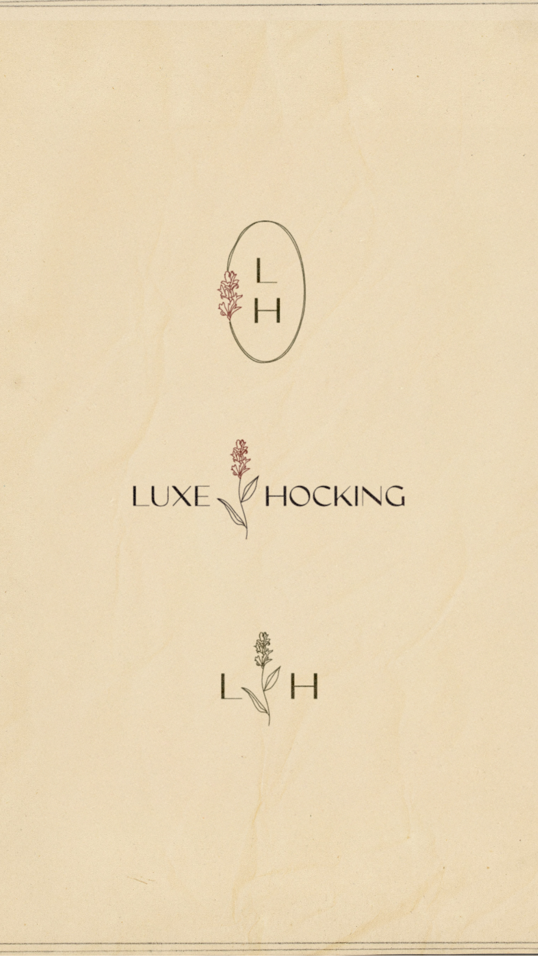
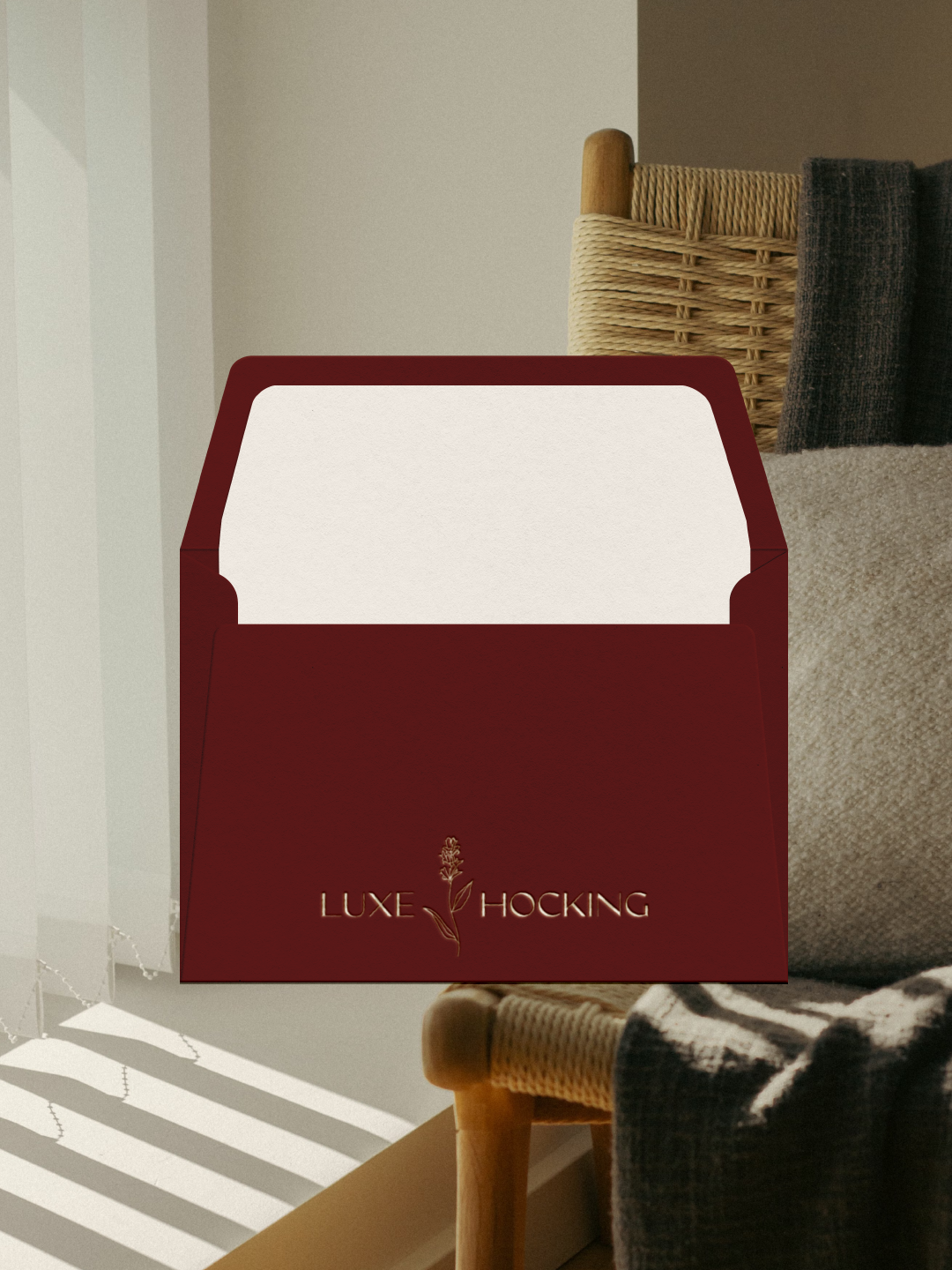
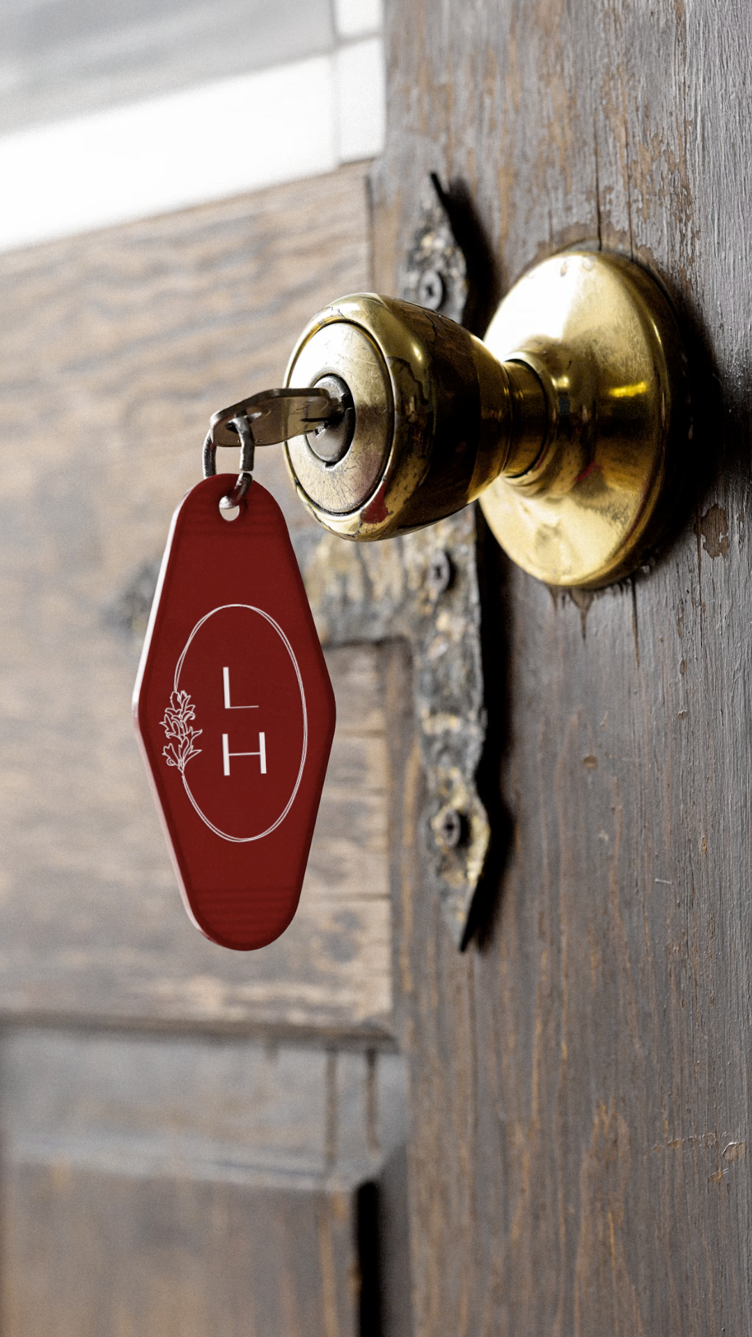
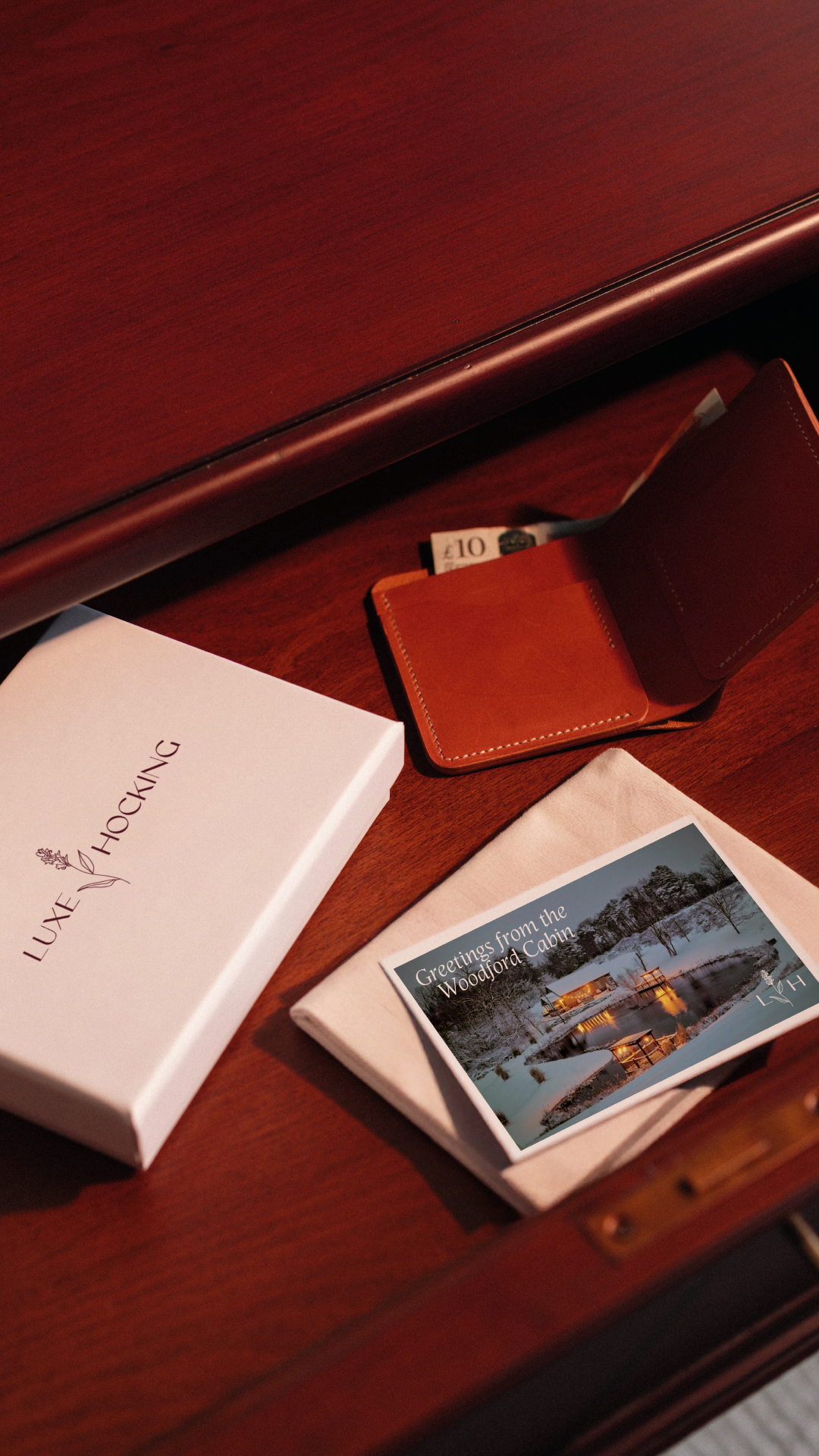
The flower was hand-illustrated as part of the visual identity, with its story carried through the website, messaging, social content, and guest experience. Together, those elements created a recognizable thread between the individual properties and the larger Luxe Hocking brand.
The Approach
With the story established, we translated the strategy into a complete brand and digital experience for the portfolio.
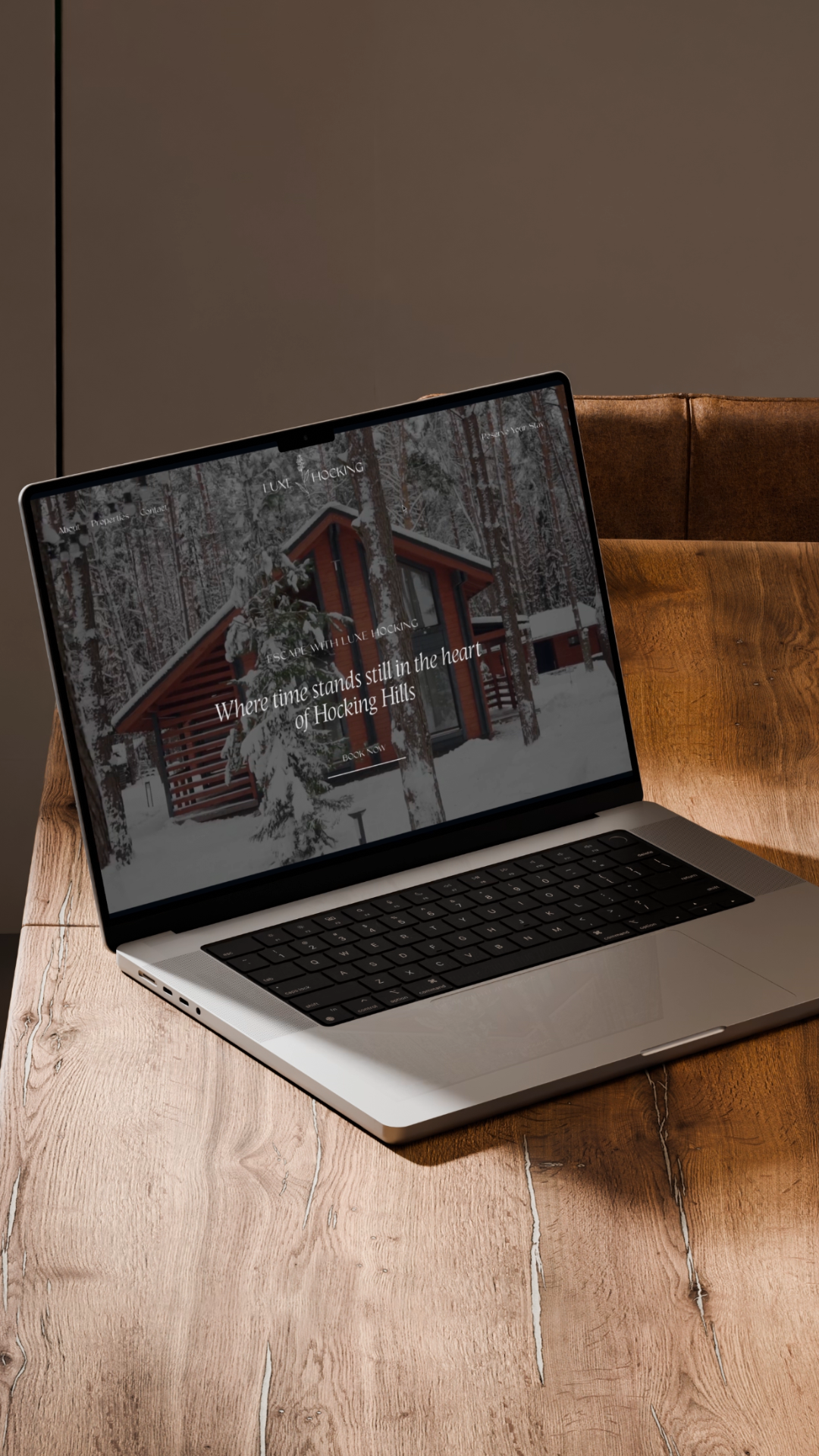
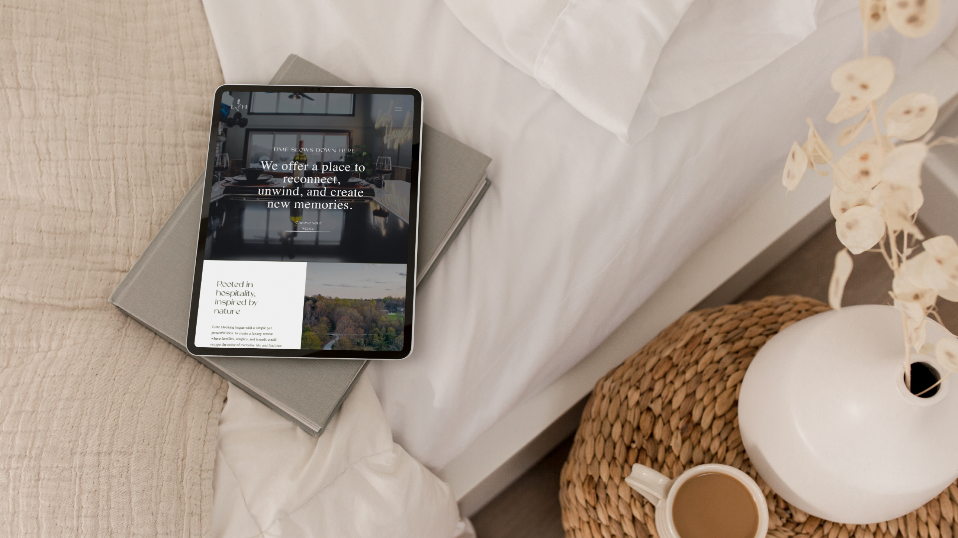
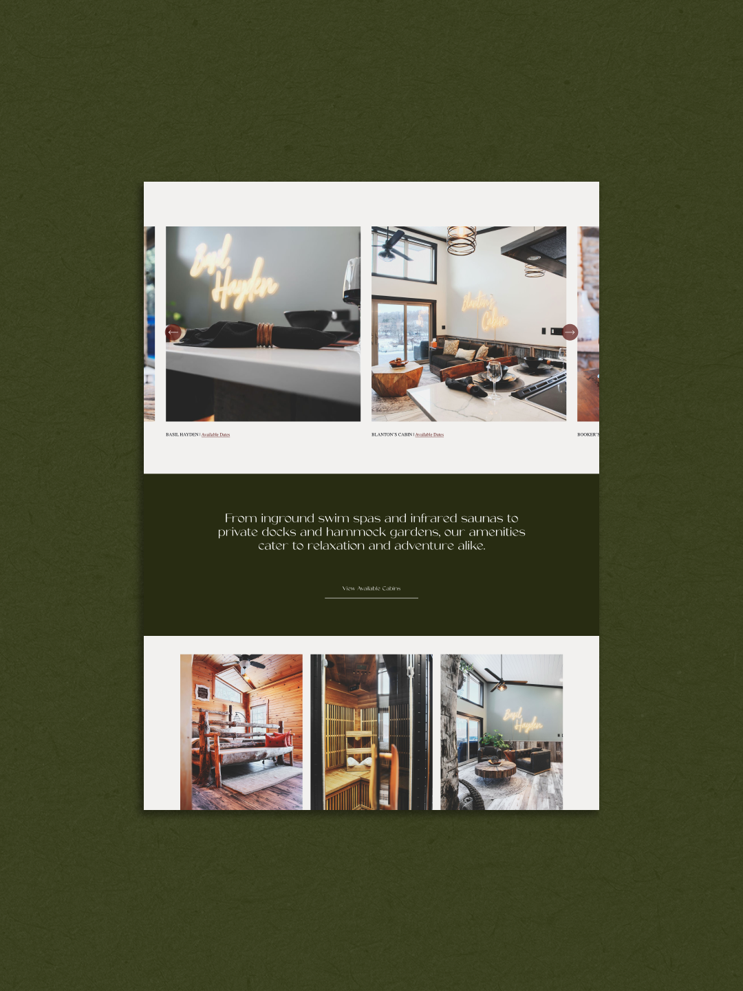
The flower was hand-illustrated as part of the visual identity, while the story informed the messaging and copy throughout the website. Photography direction helped carry the same perspective into the imagery, and the website was structured to bring the full collection into one central destination where guests could explore individual properties and discover sister stays.
The studio developed:
Brand strategy + story architecture
Messaging + copywriting
Full visual identity + custom illustration
Website strategy + design
Each piece was developed from the same strategic foundation, giving Luxe Hocking a complete system rather than a collection of disconnected brand assets.
Photography direction
SEO foundation
Portfolio structure
The Outcome
Established a unified brand across a growing portfolio
Instead of marketing multiple independent properties, Luxe Hocking now has a cohesive brand platform that connects approximately 15 cabins and lodges under one identity.
Created a distinctive market position
The brand moved beyond familiar cabin-industry aesthetics and developed an identity rooted in a story specific to the properties themselves.
Increased consistency across guest touchpoints
Website messaging, photography direction, social content, and visual identity now work together as part of the same brand system.
Built a scalable foundation
New properties can be added to the portfolio without reinventing the brand each time, giving Luxe Hocking a structure that can continue to grow with the collection.
Connected the brand to the on-property experience
Because the flower exists throughout the properties as well as within the brand identity, guests can encounter the same recognizable element both online and during their stay.
Delivered a premium online presence
The new website and identity better represent the quality of the properties and give guests one central place to explore the full Luxe Hocking collection.
Your properties don't have to lose their individuality to belong to the same brand.
If you're bringing multiple stays under one name and looking for a partner to help shape the brand behind them, start with a Spark Call. We'll learn more about your project and determine whether we're a good fit to work together.